The design, build, infrastructure development
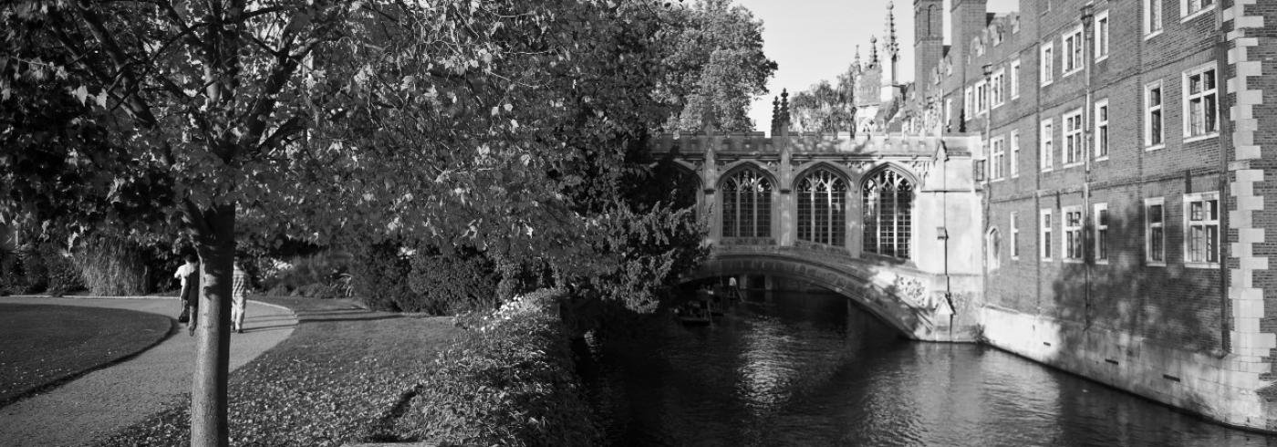
St John's College is a constituent college of the University of Cambridge founded by the Tudor matriarch Lady Margaret Beaufort. The college itself is a charitable corporation established in April 1511.
Today, it helps shape the minds of over 1,000 undergraduate and postgraduate students every year.
We started working for St John’s in 2011 when we built its first Drupal site, using Drupal 6. The design work for the site was done by Error as our first collaboration. We hosted and supported the site until 2016 when we were commissioned to redesign the site and build it in Drupal 8. Later, we upgraded it to Drupal 9.
TLDR; Highlights from our original build and ongoing work include:
- Developed a mobile-first site
- Accessibility audit
- Information architecture prioritising potential students, with images used to project the special atmosphere of a Cambridge College
- Successful content migration from the previous version of the site without significant “re-input”
- Development of a backend Intranet, including booking system using Drupal webforms with custom handlers to interface with other systems
- Providing ongoing AWS infrastructure and Drupal support, and continued collaboration with Error (for over 10 years now)
- Upgrade their site to Drupal 9
Background
In 2016, St John’s asked us to propose how we could build their new site in Drupal 8. Prior to that, we had built their first Drupal site in 2011. The site functioned as both a public website and College intranet. The public function was primarily to present information about the College to potential students, visitors, and hospitality customers. The intranet contained a document library, announcements, and forms for booking various facilities such as meals and rooms.
By 2016, they had a technical problem in that Drupal 6 was out of official support. More importantly, the College’s communications team was struggling with a structure that felt restrictive and prevented them from communicating effectively. Finally, the Drupal 6 site was not mobile-responsive as it wasn’t a priority in 2011.
As the College had a limited budget, it simply wasn’t possible to design a new mobile-responsive site and recreate all the intranet features. We solved this problem by splitting public and private areas, leaving the private on the legacy site so that we could focus on the public site.
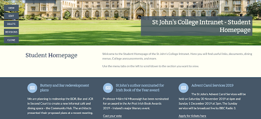
The College communication team had a very specific list of problems they wanted to solve. These included breaking out of restrictive templates and moving away from pages organised into deeply-nested menus. We produced a design concept based around longer pages that could contain different layouts within the page:
The principle was to create single pages that would contain all the information a user might need on a specific topic. In the image above, as an example, you can see the sections indicated on the left, acting as an in-page menu, and different layout and style options for text and background. This was developed as a prototype to test the concept and also confirm it was optimised for mobile.
As the new site has a completely new content model to the old one, the communications team created almost all the public pages as a manual migration. We supplemented that with automated migration for custom content such as the library’s manuscript collection.
Once the public site was launched in Autumn 2017, we turned to build the Intranet on a retainer basis. This involved recreating a number of interactive systems including meal bookings, customised dashboards for different audiences, access control to a document library, automated importing of student users, and event management. When College members log in using the central university single sign-on, they are directed back to the relevant homepage for their role: i.e. student, staff, fellow.
These dashboard pages use the same design patterns as the public site, although there are some extra patterns such as priority news. In general, the pages provide links to all the key information needed for a given group: e.g. announcements and deadlines, upcoming events, meal booking, and so on. In addition to information, the intranet uses numerous forms. These are built with the Drupal Webforms module.
This provides advanced form features such as multiple page forms, conditional logic on how and when fields appear, and customisable options for what happens to data. For example, enquiry forms simply email the form contents whereas meal bookings are added to a database that can be consulted by the hospitality department.
In terms of design challenge and approach, we mentioned above that a fully responsive, mobile-first website was a key goal for this project, to allow students and prospects to have a seamless mobile experience. Given the target audience is typically under-20s interested in the institution, this was a critical goal.
Having had an extensive rebrand, including their prospectus, they were keen to reflect that in their digital presence so the brand experience was unified. Capturing the feel of the prospectus in digital form was the main goal of the design. We wanted to achieve a magazine-like feel to the website.
Importance of the site
The higher education field is incredibly competitive. This website is the College’s main marketing tool. The number one goal of any higher education website is to present themselves in the best light possible. The buildings and the history of the College are amazing, so getting that into the website, via original photography and good content, was also key.
The College was also keen to break out of the strict templates of the Drupal 6 website and have more control over page layouts than previously. The ability to make impactful landing pages and add imagery and other design motifs from the editor interface was important to the content team. Indeed, at St John’s, editors can construct very rich pages using a wide variety of patterns that cover text, listings, and media.
When we initially built the public-facing site our assumption was that the editors would have a mix of complex landing pages which might then lead to simpler content types. In practice, they were so happy with the freedom of the landing page idea that more or less every page in the site is a landing page. What this means is that this site only has three main content types: page, event, announcement. This keeps things simple for editors as they create every page in the same interface.
Edit interface
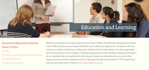
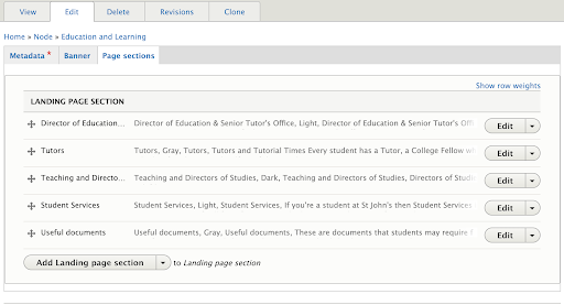
We know that having an easy-to-use interface is important in your project so this section explains how landing pages are constructed in the site. The image below shows a page on education and learning. The page consists of six sections, and the image shows the first of these sections.

When an editor views this page in the edit interface, the six sections are listed. This is shown in the next image where you can see the sections. Note that you can alter the order of sections. Also, the interface is simplified by grouping the page components into three tabs: Metadata, Banner, and Page sections.
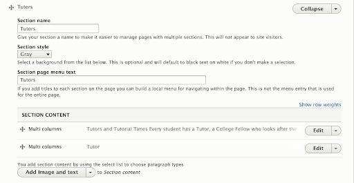
When an editor wants to update a page section the edit button opens up a view as shown below. The section menu entry and colour can be added. Below are the paragraphs that make up the section’s content. In this example, one pattern called multi-columns is used twice. This enables editors to change the number of columns within the section. The button below those shows a button called ‘Add Image and text’. That is just one of a number of different content patterns that can be added.
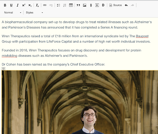
As an example of the multi-column widget, the next image shows one of these open in edit mode. It’s a standard word processor interface and most of the buttons on the toolbar should be familiar to your editors.
One exception is the ‘D’ button. When that’s pressed a popup window appears where an editor can select a file from the media library and set options for how this gets displayed. The benefit of embedding content in this way is that when that document gets updated in the media library, the link will not need to be updated on pages.
Challenges
Budget
As the College had a limited budget, it simply wasn’t possible to design a new mobile-responsive site and recreate all the intranet features. We solved this problem by splitting public and private areas, leaving the private on the legacy Drupal 6 site, firewalled away in the College network for security reasons, so that we could focus on the public site. Then, as we mentioned above, we circled back to upgrade the intranet features later.
Navigation
Navigation was a big challenge. We wanted to hang on to that prospectus feel, so we wanted something that felt like the table of contents of a magazine. The ‘mega menu’ expands and shows everything a prospective student might want to know and this is quite deliberate. We feel it translates a table of contents look and feel over to the website and improves the “findability” of the content. You have one big menu, but having said that when you start your journey and begin to browse, again, that magazine-like design comes in. You are guided by contextual links and a sense of pagination like a prospectus. You are invited to the next page without needing to return to the menu.
Editing
Finally, while the new editing interface is very liberating for an editor, it does create some new problems that need to be taken into consideration. Editors now have the power to mix and match in ways that were never envisaged by our designers, and the results can be variable. Also, while there are multiple patterns, there’s a tendency to settle on a limited set, because a time-pressed editor just needs to get the content updated, without also thinking about the aesthetics of the page layout. So some editor training was required, both in the tools available but also in applying the designs, respecting the concept and guarding the quality of the pages and their content.
The site in production
We provided the editorial team with a pre-production version of the new site in Spring 2017. The communications team used the Summer vacation to build the new site for launch in October. They were absolutely delighted with the flexibility offered by the new system, and the improvements in the admin interface provided by Drupal 8. Whereas they had previously been unable to achieve custom layouts, now literally every page has a custom layout.
While that’s very liberating for an editor, it does create some new problems that need to be taken into consideration. Editors now have the power to mix and match in ways that were never envisaged by our designers, and the results can be variable. Also, while there are multiple patterns, there’s a tendency to settle on a limited set, because a time-pressed editor just needs to get the content updated, without also thinking about the aesthetics of the page layout.
Upgrades included
As part of our efforts to keep the website's code up-to-date, as much as possible, we were glad to upgrade the site to Drupal 9 in January (2022) and have continued to keep them on the latest version ever since.
We:
- Maintain their custom modules compatible with the latest Drupal
- Provide patches where necessary to contrib modules awaiting updates
- Ensure the codebase and also the local development stack remains current
We have since refreshed St John’s College website, which we are proud to have designed and built, and you will be happy to know we still work with the designer who created that website, Aaron Williams.