This picture is blurry in my Mac. What is happening? I'll try to explain in the following blog. SPOILER: It's not very long :)
A very frequent use case in our projects is about printing authoring information within a content view mode. This is very often and somehow you always get into problems while trying to render user profile images for different viewports. This is also a well-known problem at drupal.org and one day, the community decided to solve it by introducing breakpoints on the system.
What are breakpoints?
You’ll probably know but just in case, a breakpoint in a theme is the dimension of the viewport that we use to provide different styles and behaviours to html elements. Something simple to understand might be the font-size. You can give a bigger size to the font if you are in a wide screen and a smaller size if your viewport is a narrow one. This should be manage using breakpoints to define the good font-size per device according to its dimenssion.
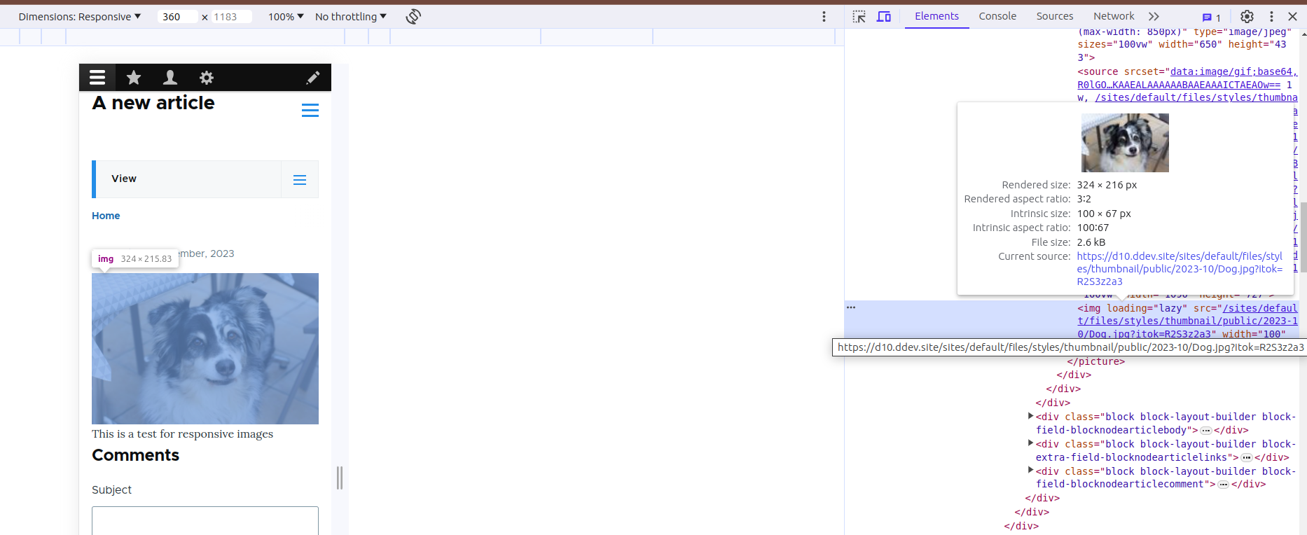
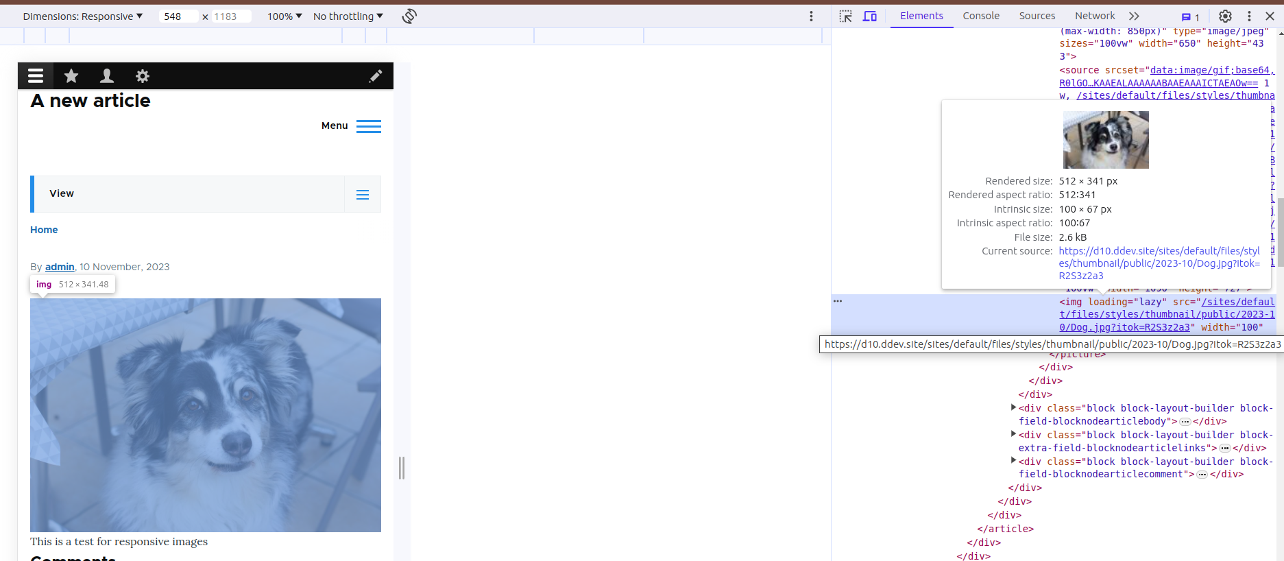
Compare these two pictures and the render size of the final images
For 360px the final rendered image is 324x216
When we change it to a wider screen, we can see the rendered image is bigger
So we create several breakpoints on the system to define general considerations for different viewports. For example, we can define the typical breakpoint for mobile at 780px, for tablets at 1024px and from that dimension we’ll consider it’s a wide screen. Let's see this in an example. Here is the file for the breakpoints definition in one of a custom module: ce_breakpoints.breakpoints.yml
ce_breakpoints.images.mobile:
label: 'CE Breakpoint for mobile'
mediaQuery: ''
weight: 0
multipliers:
- 1x
- 1.5x
- 2x
ce_breakpoints.images.tablet:
label: 'CE Breakpoint for tablet'
mediaQuery: 'all and (min-width: 560px) and (max-width: 850px)'
weight: 0
multipliers:
- 1x
- 1.5x
- 2x
ce_breakpoints.images.desktop:
label: 'CE Breakpoint for desktop'
mediaQuery: 'all and (min-width: 851px)'
weight: 0
multipliers:
- 1x
- 1.5x
- 2x
Each of the breakpoints has several properties that we need to provide. A label which is self-explanatory, a mediaQuery where we have to define the media query for the breakpoint, a weight and a multipliers. We’ll come later to the multipliers property.
Said that, we can configure the image style to be used for rendering images. Let’s say the design indicates that we have to use a 50x50px for the user’s picture in mobile. In that case, we can set it in an image style of 50x50px on a 1x multiplier.
You could add several image styles for this configuration and leave the navigator to decide which will be the best for your device. Then the problem knocks at your door. and checking it with different types of screens make them blurry because they have different pixel densities. Retina has a 2px density which means that if you provide this image style to a retina device it will make it 25x25 pixels real size but your css says it’s 50x50 and it expands it making the image blurry.
This is when multipliers come to rescue and let us define a 100x100 pixels for 2x multipliers making a real 50x50 px without need to upscale the image and make it blurry. The traditional solution would have been to provide a 100x100 pixels image and establish the 50x50 by css. Using this solution will provide a better image for each device.
Final markup to navigator will contains all the possible cases according to config. In my example I got this but it will vary depending on the settings.
<picture>

    <source srcset="https://www.codeenigma.com/sites/default/files/styles/max_650x650/public/2023-10/Dog.jpg?itok=uhSFr657 650w, https://www.codeenigma.com/sites/default/files/styles/max_1300x1300/public/2023-10/Dog.jpg?itok=ccXHrzEo 1300w, https://www.codeenigma.com/sites/default/files/styles/max_2600x2600/public/2023-10/Dog.jpg?itok=IlwT94-Y 2600w" media="all and (min-width: 851px)" type="image/jpeg" sizes="100vw" width="650" height="433">
<source srcset="https://www.codeenigma.com/sites/default/files/styles/large/public/2023-10/Dog.jpg?itok=BnGll9UT 480w, https://www.codeenigma.com/sites/default/files/styles/max_650x650/public/2023-10/Dog.jpg?itok=uhSFr657 650w, https://www.codeenigma.com/sites/default/files/styles/max_1300x1300/public/2023-10/Dog.jpg?itok=ccXHrzEo 1300w" media="all and (min-width: 560px) and (max-width: 850px)" type="image/jpeg" sizes="100vw" width="650" height="433">
<source srcset=", https://www.codeenigma.com/R0lGODlhAQABAIABAP///wAAACH5BAEKAAEALAAAAAABAAEAAAICTAEAOw%3D%3D 1w, https://www.codeenigma.com/sites/default/files/styles/thumbnail/public/2023-10/Dog.jpg?itok=R2S3z2a3 100w, https://www.codeenigma.com/sites/default/files/styles/medium/public/2023-10/Dog.jpg?itok=jlUh1oNB 220w, https://www.codeenigma.com/sites/default/files/styles/max_320/public/2023-10/Dog.jpg?itok=yBUFrZpu 320w, https://www.codeenigma.com/sites/default/files/styles/max_325x325/public/2023-10/Dog.jpg?itok=1DVW1CZ3 325w, https://www.codeenigma.com/sites/default/files/styles/max_480/public/2023-10/Dog.jpg?itok=vqfCtAaZ 480w, https://www.codeenigma.com/sites/default/files/styles/max_650x650/public/2023-10/Dog.jpg?itok=uhSFr657 650w, https://www.codeenigma.com/sites/default/files/styles/wide/public/2023-10/Dog.jpg?itok=-CkVQdje 1090w" sizes="100vw" width="1090" height="727">
<img loading="lazy" src="https://www.codeenigma.com/sites/default/files/styles/thumbnail/public/2023-10/Dog.jpg?itok=R2S3z2a3" width="100" height="67" alt="Dog picture">
</picture>
You can see how the last source element contains different options to be rendered.
(Hero Photo by Roberto Nickson: https://www.pexels.com/photo/woman-holding-tablet-computer-3082341/)