Dark Mode
It's accessible, sustainable and otherwise, pretty cool to look at. Right? The idea is that it reduces damage being done to your circadian rhythm when you hold your bright phone screen to your face whilst you're in bed, just before you (try to) sleep.
Blue light coming from your screen limits your melatonin production. This is the hormones needed for controlling your sleep-wake cycle. Less melatonin means a harder time both falling and remaining asleep.
To combat this, apps are introducing dark mode. A great response by developers, no? Well, it might not be that great.
Halation
Halation is caused by dark mode. It is the spread of light beyond its natural boundaries, causing a blur or fog around the edge of your bright screen. Halation impacts how those with astigmatism are able to perceive a digital interface.
Astigmatism
Astigmatism is a kind of refractive error. The eye doesn't focus light particularly evenly on the retina. This renders the individual with blurred and/or distorted vision regardless of distance. This is typically coupled with headaches, eyestrain and difficulties with night driving.
This is largely down to the shape of the eye. It is more rugby ball-shaped than spherical. Light is therefore focused on more than one part of the eye. This can occur in those with either long or short-sightedness.
No one's eyes are 100% perfect and, interestingly, most people have some degree of astigmatism.
Dark mode can have a significant impact on those with astigmatism. The cause is the way their lense responds to the light.
Here's an example of the difference between someone with and without astigmatism. The left image is known as the 'halation effect'.
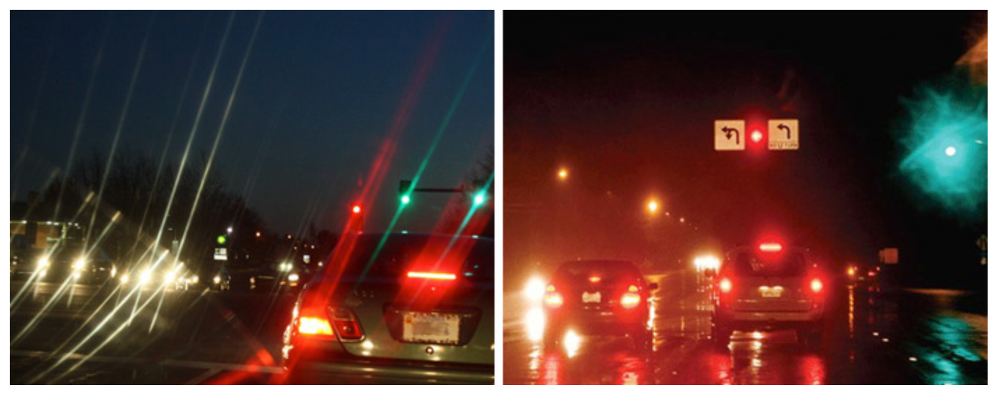
Now imagine on a small screen with tiny font. As the lines get closer together, the harder it becomes to read to the user.
Are all people with astigmatism affected?
Luckily, no.
Astigmatism shows itself at a certain level of severity, if it's left untreated or if it's a given kind where wearing glasses don't have any impact.
To put this into context. Say 50% of your users need to wear glasses and half of them don't wear any, that becomes 25% of your users who experience difficulty with your site or app.
Let's assume 25% of your users don't permanently need glasses but they also get this issue in conditions of low lighting; that's a total of 50% of your users experiencing a shared issue.
Is dark mode impacting your users?
We've outlined that 50% of the world population shares an inaccessibility issue. The positive is, those unaffected can get a little empathy. Dark mode has largely been used by those with photophobia (light sensitivity) or other visual impairments.
The generic internet user has some contrast preferences:
-
Black on white
-
White on black
-
Black on yellow
-
Black on grey
-
Blue on white
This refers to people with no noted visual impairment(s). They're the ones who get designed for, on the whole. The fact will always remain that eyes are pretty unique to the individual and there isn't a one-size-fits-all solution.
If there's no solution, what can we do?
Designers should be clear about why they're making certain choices. They should be a result of research regarding best practise and always keeping the users' needs at the core.
Give control to the user
Make dark mode an option, always. Make all adjustments optional, for that matter. Those with needs that don't fall into that of the majority should be able to control as much as is possible because, as we said, there is no one-size-fits-all
Don't worry; no one's suggesting a never-ending stream of design versions. Simply the ability to appropriately control font size and colour, etc. The challenge is staying true to your original design concept. No one said this was easy!
The take-home message is - give your users control; make dark mode optional.